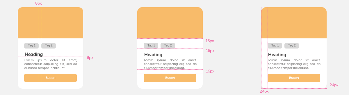
In the world of user interface (UI) design, small details make a big difference. One of the most powerful yet simple principles that designers swear by is the 8px rule. It’s not just a guideline; it’s a system that brings clarity, consistency, and scalability to digital design.
What Is the 8px Rule?
The 8px rule is a spacing and sizing system where all measurements, margins, paddings, font sizes, icons, and layout elements are based on multiples of 8 pixels (8, 16, 24, 32, etc.). This modular approach creates a predictable rhythm across the interface, making it easier to design, develop, and maintain.
Why 8 Pixels?
- Divisible and Scalable: 8 is divisible by 2 and 4, making it flexible for both small and large screens.
- Grid Alignment: It aligns perfectly with common grid systems, ensuring visual harmony.
- Developer-Friendly: Developers can implement designs more easily when spacing follows a consistent pattern.
Benefits of the 8px Rule
- Consistency: Uniform spacing creates a cohesive look and feel across the product.
- Efficiency: Speeds up design decisions and reduces guesswork.
- Responsiveness: Makes it easier to adapt layouts to different screen sizes.
- Accessibility: Predictable spacing improves readability and touch targets.
How to Apply It
- Typography: Use font sizes like 16px, 24px, or 32px to maintain vertical rhythm.
- Spacing: Apply margins and paddings in increments of 8px (e.g., 8px, 16px, 24px).
- Components: Design buttons, cards, and icons with dimensions that follow the rule.
- Grid Systems: Build layouts on an 8px baseline grid to ensure alignment and balance.
Common Pitfalls
- Rigid Application: Don’t force the rule where it breaks usability—use judgment.
- Ignoring Context: Some elements may need more breathing room depending on the content or device.
- Overcomplication: Avoid mixing multiple spacing systems (e.g., 5px, 10px) alongside the 8px rule.
Real-World Examples
Design systems like Google’s Material Design and IBM’s Carbon Design System embrace the 8px rule to maintain consistency across platforms. It’s also widely used in mobile app design, where spacing precision directly affects usability and touch interactions.
Final Thoughts
The 8px rule is more than a design hack; it’s a philosophy of clarity and order. By adopting it, designers and developers can create interfaces that feel intuitive, polished, and scalable. Whether you’re building a mobile app, a website, or a design system, this simple rule can elevate your work from good to great.