
Pure Sip

Used tools: ![]()
![]()
Role: Lead UX/UI designer
Responsibilities:
• User Research
• Wireframing
• Visual Design
• Prototyping
User Research: Identifying Our Audience
We started by trying to understand who our users are, what they want, and what they look for. After a deep market analysis, we developed two distinct personas. By designing specifically for these two user types, we were able to create a flexible experience that meets their needs and goals.

Persona 1: Busy Alex
- Demographics: Male, 32, a professional with a demanding job.
- Goals: Needs a fast way to get a healthy drink during his busy day. Prefers convenience to anything else.
- Struggle: Finds most food and drink apps to be slow and complicated. Gets frustrated by multi-step checkouts and too many menus.
- Needs: A simple user flow for ordering, a possibility to reorder, and minimal screen taps to complete a purchase.

Persona 2: Wellness Maya
- Demographics: Female, 26, a health enthusiast and active person.
- Goals: Wants detailed information about ingredients, nutritional benefits. Enjoys exploring new drinks.
- struggle: Stays away from brands that lack transparency. Finds generic filter options not very helpful and wants a more personalized experience.
- Needs: A robust filtering system, detailed product pages, and a way to discover drinks based on specific health goals.
Usability & Interaction Design
The core of our UX design is creating an app that is not only functional but also a pleasure to use.

Speed and Performance:
The priority for us was fast loading times for images and pages, recognizing that a slow app is a frustrating app.

Intuitive Gestures:
We integrated mobile gestures like swiping to navigate between products, making the experience feel responsive.

Clear Feedback:
Every user action, from adding an item to the cart to placing an order, is met with clear visual feedback.

Accessibility:
The design is ruled by accessibility standards, including high-contrast text for easy readability,
User's journey
I've migrated entirely from Miro to FigJam for things like customer journey mapping and agile planning. This was a necessary move to consolidate my entire workflow. Since I spend most of my time in Figma for all my UX/UI design work anyway, I needed to keep my projects in one connected ecosystem. It cuts down on app-switching and keeps strategy next to design.
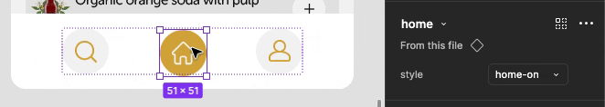
Style Guide & Design System
Color Palette
When you see that soft, golden color, your brain already knows what’s up. It’s the shade of real, honest health like turmeric, ginger, or sun-warmed honey tea. This isn’t a factory color; it’s a direct signal that the drink is packed with natural, plant-based ingredients, not artificial junk. It’s the color of a great harvest, tying the product right back to the earth.

Typography
Clean and modern fonts for clarity and readability.
Museo Sans Rounded
Museo Sans Rounded
Museo Sans Rounded


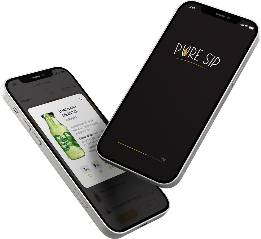
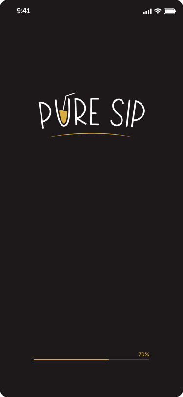
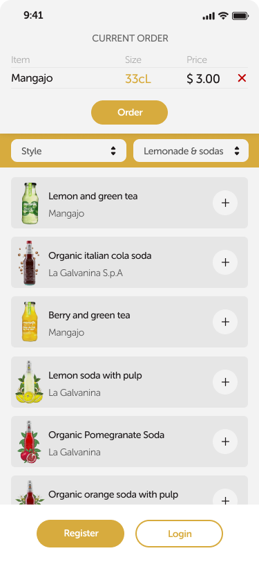
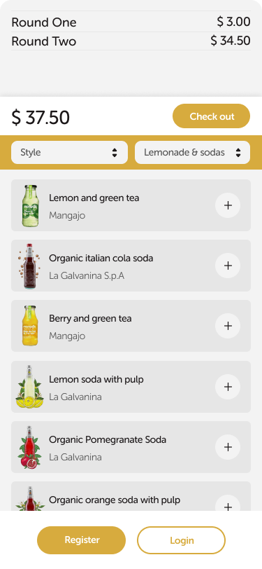
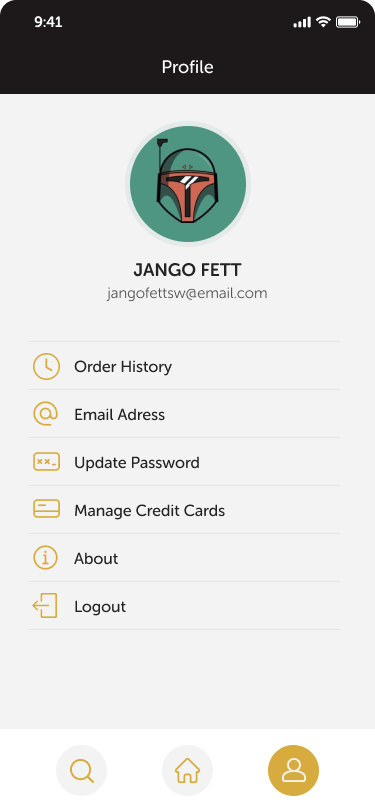
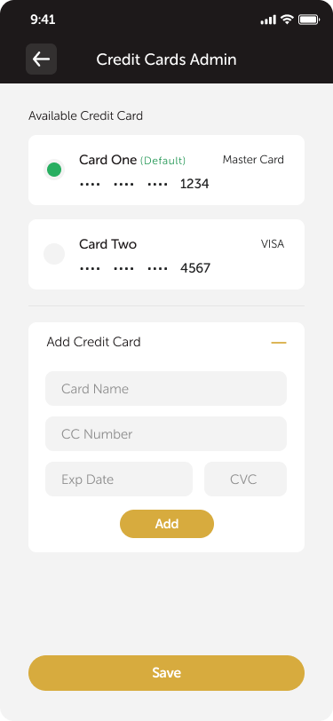
Sample Screens & Prototype


Conclusion
This UX study for the “Pure Sip” mobile app outlines a design strategy focused on efficiency and transparency. By understanding the diverse needs of our user base, we have created a design that ensures speed and simplicity for those who know what they want, while also being informative and engaging for those who wish to explore.